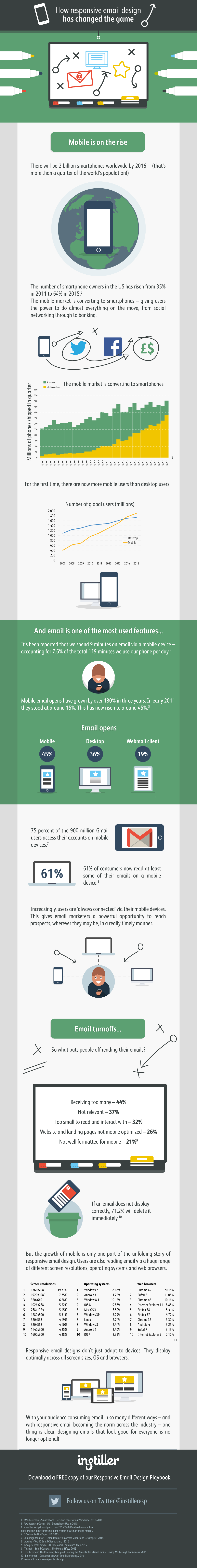
There’s no doubt that responsive email design has changed the game when it comes to email marketing. In our latest infographic, we wanted to paint a picture of just how profound that change has been.
For the uninitiated, a responsive email design automatically adapts to the device the message is being displayed. And the most obvious starting point is the rise of the smartphone.
It feels like they’ve been part of our lives forever, but, incredibly, the adoption of smartphones has doubled in just four years. As we’ve turned to our phones for an increasing range of tasks, though, email has held constant – it remains one of the most used functionalities. And, with so many users happy to delete an email without hesitation if it doesn’t display correctly, responsive email design is a huge deal. It can make or break any email campaign.
There’s more to the responsive email design story than this, though, with an unprecedented number of screen resolutions, operating systems and web browsers now in use.
With your audience consuming email in so many different ways – and with responsive email design becoming the norm across the industry – one thing is clear: designing emails that look good for everyone is no longer optional!
Check out the full infographic below, and keep your eyes peeled for our upcoming ebook, ‘The responsive email design playbook’, with plenty of responsive email design tips and tricks to help you along your way!