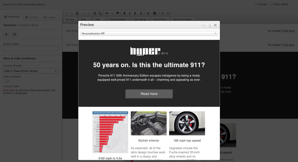
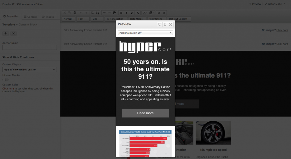
You’re more than likely aware of the importance of responsive email design and the pitfalls of not opting to use it:
- Poor user experience
- Less likely your email will be opened and more likely it’ll end up deleted
- Poor ROI
- The risk of looking like an unprofessional agency that doesn’t know what they’re doing.
And since 91% of users now check their email at least once a day on their smartphone you’d be pretty out the loop if you weren’t using responsive email.
But what happens if you’re using it but still not getting the results you’d hoped?
Well like anything there are things to make sure you do and don’t do to get the most out of it. So to help you we’ve put a list together of common responsive email mistakes to help make sure you don’t make them.
1. Not thinking of mobile
Considering the fact that some brands say they’ve seen upwards of 70% of their emails opened on mobile devices it would be most appropriate to think about how your email is going to look when it gets opened on iOS and android; not just one or the other either. Luckily our solution has Litmus integrated as standard which allows you to preview how email templates look in all major email clients and on mobile devices.
2. Not getting to the point
Long winded paragraphs are hard enough to read and take in on a desktop screen never mind once they’ve been shrunk down to 320 pixels. Ensure you keep your paragraphs short and to the point; that way readers will find it much easier to skim and understand what they’re suppose to do next. Make sure you test what you’re text will look like on all platforms; I’ll go into that in more detail in a moment.
3. Not thinking about the images
This is one of the most challenging areas when creating responsive layouts in email. Too wide, they’ll break the layout and if the images come with text they can often be unreadable on small devices. We recommend images be less than 100Kb each. If you use larger images in the email, or a lot, you run the risk of being undeliverable and they can be very slow to load on mobile which may result in deletion! So make sure you think about your images.
4. Not thinking the responsive design through to the end
So you’ve designed a beautifully responsive email which gets people clicking through but when they do the landing page doesn’t match up. Think logically if they’re opening the email on their tablet they’re going to be viewing the landing page on that device too. Lining and matching up the two will almost guarantee a greater conversion rate. Follow this with a responsive thank you page and you’re golden.
5. Not testing
Testing your email design is an important part of ensuring you get what you need from your email campaign. It can also be useful in helping you figure out whether or not your design is appropriate for all possible devices. With our drag and drop email design it’s also super easy to quickly preview what the email will look like on desktop and mobile with the click of a button.
Closing thoughts
Now you know what mistakes to avoid making when using the responsive email design it should be a breeze to create email marketing campaigns that will wow your clients.
We hope this goes a long way to helping you but if you have any further questions about responsive email design or would like more information on Instiller, please get in touch!

