If you want to create a stunning landing page without using any code then you have come to the right place. We can help you to craft a landing page that not only converts, but that really stands out from the crowd. If you want to learn what makes a good landing page then simply take a look below.
What should A landing page include?
When creating any landing page, you have to make sure that it contains a number of elements. The top elements you need to include would be a headline, and an optional sub-headline. You also need to include a description of what is being offered. Having one supporting image or short video is a good idea, as is having proof elements. This could include a site security badge, customer testimonials or logos of the other companies you have worked with. What’s more important than any of this however is to make sure that there is a form on the landing page itself, as this will help you to capture the information you need. This could be an email address, phone number or simply the name and age of your potential customer.
What are the 5 types of landing pages?
- Squeeze page
- Long-form page
- Click-through
- Product details
- Video page
There are five major types of landing page. If you want to find out more about them then simply take a look below.
Squeeze page
A squeeze page is also known as a lead capture page. The aim of this is to squeeze information out of the person visiting your site. This information is normally personal data, so it could be a name, age, phone number or even email address. This kind of information is normally exchanged for some kind of offer. It could be a free trial for some downloadable content or an email-sign up. This page will usually have a CTA, a headline, a few images, some copy and a form. The best pages have a simple form to fill out with the submission button being very easy to locate.
Long-form page
A long-form landing page is also known as being a sales letter. This type of page tends to focus on the benefits of a product. The longer someone spends on this type of page, the more likely they are to convert. Ideally, you’ll have great copy which pulls the reader further down the page. Each paragraph should assure them that they are making the right decision. Words should have an exciting tone and the visitor should also experience some fear of missing out. Typically, the word count for a long-form page exceeds 7,000. Testimonials should also be included to drive home the point.
Click-through
This type of landing page gives just enough context to encourage people to visit a page. Click-through pages warm up leads so that they are easier to convert. Ideally, this page will have sufficient information about the offer and it should also give an explanation about the service. The only button this page should have is to the purchase page. You don’t need a lot of content for pages like this, but you should be trying to add a headline, a bullet-point list of benefits, an image or visual and a CTA.
Product details
This will exist on your main website. It will give information about your service or your product. Visitors can read about it, and then they can go ahead and either complete their purchases, or they can contact one of your team members to learn more. A lot of landing pages do not have any kind of navigation from the page, but this one does. You will usually have a website menu along with details about the offer and social proof.
Video page
A video landing page will usually contain a sales video. The video will be the main focus of this landing page. It’s above the fold in most instances and it could even have some complementary text. If you want to encourage visitors to watch the video then you may want to have an offer which is contingent on them watching a sufficient portion of it. Your video should explain the value of what it is you’re offering and it should also be a few minutes long.
What makes A good landing page design?
Landing pages are very successful when you include a few different elements. As a general rule, you need to have copy that is clear and compelling. Having a solid CTA is also important, as is making sure that you always think about what you’re offering your customer and who they are in terms of your target audience.
Flow of landing pages
Your landing page may, or may not lead to other pages. It may be that you just have a landing page with a button to buy, or that you have a “coming soon” page. Either way, it doesn’t matter what your aim is because your page has to flow. If your page is clunky or if it is too boxy in terms of the design then this will turn your visitors off your site and this is the last thing you need. Make sure that you always take into account the flow, and how one part of the page flows into the next. Ensuring that you have cohesion between your elements is also crucial, so be mindful of this if you can.
Highlights and contrast
The design principle of highlighting is about using background colours to accentuate the focus of your landing page. Contrasting colours tend to be sharp variations or even changes in colour. Humans are psychologically attracted to this kind of difference. If you use this to highlight certain areas of your landing page then this will work in your favour. Your heading, form for lead capture and CTA should be the prominent parts of the page, and by using contrasting colours or highlights, you can ensure that this is the case.
Element proximity and white space
White space is imperative when it comes to your site design. You may not notice how much white space helps readability until you realise it’s missing. Have you ever tried to read a document where the words are printed all the way up to the margin? If so you’ll know how hard it is to get to the end without feeling fatigued. Readability is even more important in the online world. Readers want answers, and they want them quickly. Studies have shown that internet users tend to read 18% of a website page before moving on. White space can help you to ensure that they read the full 18% and not less.
What are some examples of landing page designs?
You can find some solid examples of great landing pages, below.
Shopify
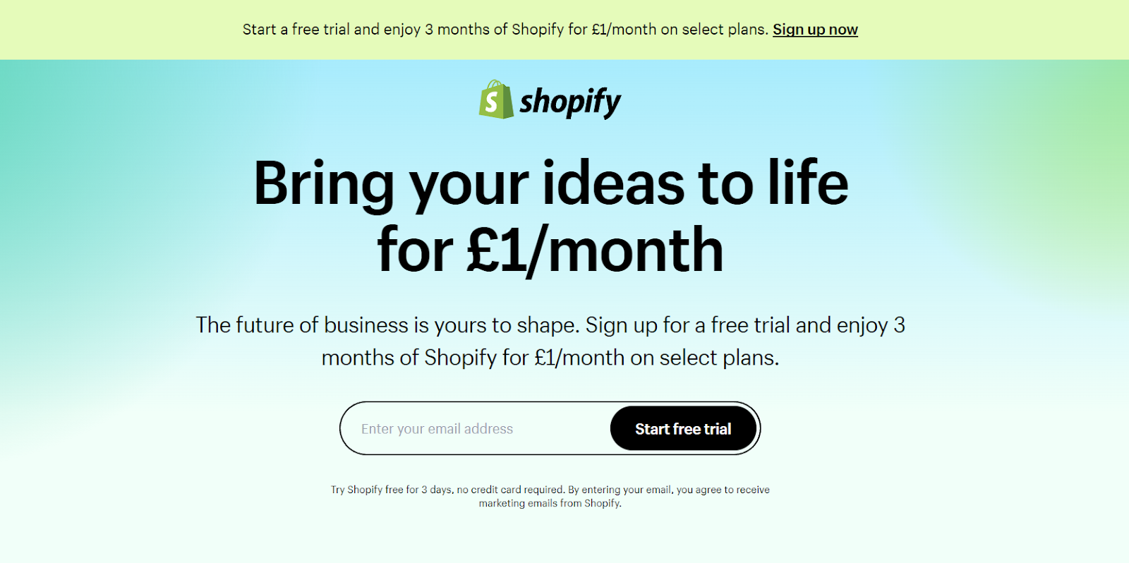
Shopify’s trial landing page is ideal for sellers. Why? Because it keeps things simple. It’s not heavy on text but it is great at persuading you about a few key points. Visitors who leave the site will do so knowing that it’s easy to use and trusted by a lot of people. The clean interface is great and the headline is bold and clear. The page has some very simple graphics but this works very well. The concise CTA works well too.
Great Jones
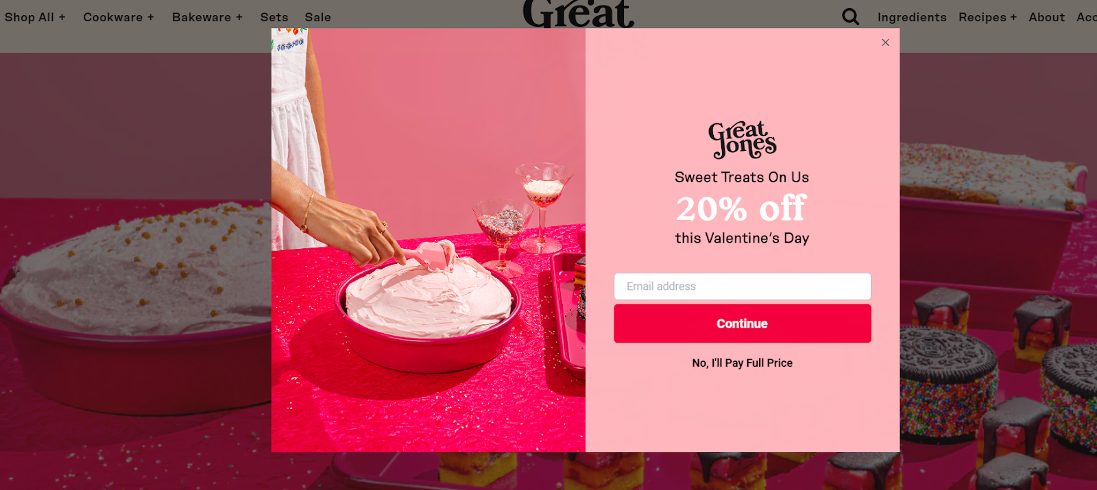
This landing page is fantastic. It’s bright, it’s as beautiful as the products they sell and it helps to tap into your kitchen dreams. The bold colours help their cookware to stand out and on top of that, they have an email sign-up box as soon as you land. If you were to not enter your email, you’re agreeing to pay full price, which is a very motivating way to get customers to enter the sales funnel as a potential lead.
Muzzle
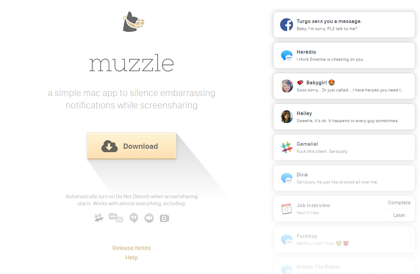
This is an app that silences your on-screen notifications. It’s a very minimal landing page but what makes it work so well is the notifications that pop up at the side. The idea of a landing page is so users can decide if your product is worth buying or not. What better way to communicate the value that you have, than by confronting your visitors with the issue that the app is designed to solve? It’s a show rather than tell, and in the left corner, you’ll be faced with an onslaught of highly embarrassing notifications. This helps to push the app’s message in a way that is simpler than ever.
Using Instiller to make landing page designs
Want to create a solid landing page design? If so, Instiller is the way to go. It’s a fantastic way for you to make sure that you have all of the above elements and you could have more sales and leads before you know it. Instiller is a solution with no coding. It’s a drag-and-drop system that is able to function well on any device.
Conclusion
So if you want to make the most out of your landing page design then the best thing you can do is make sure that your design is cohesive and that it is to the point. Making sure that you have pop-ups, and embedded forms will also help, all of which Instiller can provide you with, sign up for a free trial today, and explore Instiller.