Whether you’re a marketer, designer or developer you’ll have heard the phrase ‘Responsive Web Design’ in recent years. The phrase, originally coined by Ethan Marcotte back in 2010, is used to describe a website or HTML email that responds to the device width it’s being viewed on.
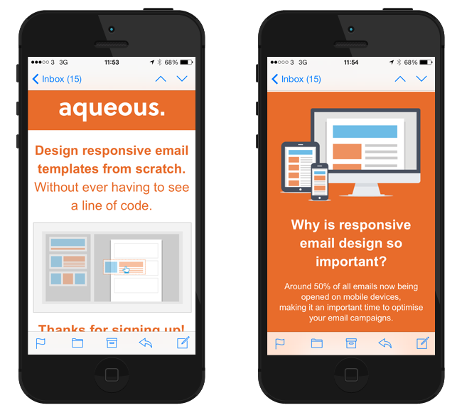
Towards the end of 2013 Litmus reported that mobile opens had hit a massive 51% – there’s never been a more appropriate time to switch to using responsive design for your email campaigns to ensure you have the most effective reach.
What are the benefits?
With such a high percentage of users now using mobile devices, the effectiveness of your email marketing campaign becomes greatly influenced by whether your template displays correctly on mobile devices.
The great thing about creating responsive email templates is that it forces you to think more about the content hierarchy. Because the likely layout on mobile is a single full width column, it encourages the designer/developer to consider the position of important/feature content.
Responsive design does also increase conversions and click rate, owing to the UX improvement of larger CTA’s and a more considered layout.
An increasing number of consumers use their smartphone as their primary device for checking email, so it makes sense for you to ensure your campaign displays correctly for mobile going forward.
The responsive approach
Owing to current mobile device widths it makes sense for the mobile view to be a single column – to allow images, text and call to actions to be displayed clearly on smaller screens.
The email’s structure and content should be simplified (text content should be text, no sliced JPEG’s here!) to allow for the content to reflow as the window width changes and important call to actions should have a large ‘tappable’ area as touch screens are far less accurate than a mouse and pointer. Some mobile email clients block images by default so this is still worth taking into consideration.
Segmentation by device?
We’ve seen in the past campaigns setup specifically to target mobile device users – with a template designed specifically for smaller devices.
We’d recommend against this for various reasons. Not only does it add unnecessary and time consuming list management, it’s likely that the same users will view the email on a desktop client as well. Rather than treating regular smartphone users differently, the best approach is to use a responsive template.
Conclusion
As you can see, there are some compelling reasons to adopt responsive design for your email marketing campaigns. If you’re not doing so already, there couldn’t be a more important time to do so. Perhaps most importantly is to test, test and test again. Creating a responsive template has it’s own complexities and we’d recommend extensive testing using Litmus to see how your template displays across email clients. It’s also worth analysing the results of a previous campaign to see what people are using to view your campaigns. Additionally, ensuring your responsive HTML template is up to standard is only part of the puzzle – you’ll need to ensure the site you’re linking back to works well on mobile too.
Useful Resources
- Aqueous – Create responsive email designs from scratch
- Litmus – Mobile opens hit 51%
- Litmus – Ditch the “Mobile Version” of your email
- Zurb – Ink