In early 2014, Google started rolling out a further incremental change to their tabbed Inbox. The update was only made availble to users that have opted in for the new Gmail Promotions Tab feature.
The promotions tab adds a gallery style view to Gmail, using ‘cards’ with large feature images, brand logo and caption – almost reminiscent of Pintrest’s ‘pins’.
We really like this update to Gmail and wasted no-time adding a neat feature so that promotion tab details can be added to email template within Instiller.
How does it look?
Providing you’re one of the users Gmail has rolled this feature out to, then you should see a new tab labelled ‘Promotions’ in your inbox.
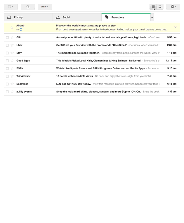
The promotions tab using a gallery style listing as opposed to the regular email listing using text.
Each message displayed in the promotions tab is displayed as a ‘card’ using a feature image with sender info and subject line over-layed so it’s really easy to see who the email is from and to skim read.
For the most effective display, a concise Sender Name (20 characters) and Subject Line (75 characters) should be considered as the card display means there is limited space for text. It’s also worth thinking about how the promotional image relates back to the Subject Line – they should compliment each other.
As well as the grid view there’s also the traditional ‘list’ view – displaying the regular Sender Name and Subject line.
Be sure to test your email campaigns with both layouts so you can cater for both displays.
Benefits and pitfalls
Historically, there’s been little marketers can do in order to make their email stand out in their recipients Inbox – being limited only to creative subject lines – perhaps with A/B testing, characters in subject lines and sender name.
The great thing about Gmail Promotions is that emails can now be displayed with much greater visual impact – with a large feature image, complimentary subject and immediate brand association with the sender logo.
An added bonus is that through including the sender logo it can also drive traffic back to your Google+ page.
Every email marketer should now be considering how emails appear in the Gmail promotions tab – users can now easily skim read and any emails that aren’t presented in a visually impressive way run the risk of being deleted before being opened.
How can I include this in my email campaigns?
There are two methods (JSON or HTML Microdata) for adding feature content to email template and it’s all nicely documented on the Gmail Developers Blog.
There are also further considerations required when it comes to your feature image – it must be publicly available and at least 580x400px in dimensions.
If larger images are used then Google will resize to fit the display – which can have varying results and if smaller may only display raw text in it’s place.
When images are missing, Google will try and use one from your campaign but again this has varying results and may not be relevant to your subject line.
In order for the sender logo to be displayed the sending domain should be the same as the domain name used in the brands Google+ profile.
Generate some code
If you aren’t techie enough to follow the Gmail developer info for this but are still curious to see what one of your email campaigns could like like in the Gmail promotions tab then try this handy utility over at Litmus – http://pages.litmus.com/gmail-offers
Add to email templates using Instiller
In a recent update to we added a feature to help preview how emails may look when displayed on the Gmail promotions tab.
We’ve also made it easy to add the required data to your templates using our drag and drag responsive Email Designer feature.